Thursday, November 14, 2019

Supermom: Expecting Trouble #1 Review

Note: I received a digital copy from writer Gordon McLean to review.

Writer: Gordon McClean
Artist: Caio Oliveira
Rating: 7 of 8

Supermom: 
Expecting Trouble #1
Image result for supermom expecting trouble
When there's been so many different stories, it can be hard to make yours stand out. It can be particularly difficult when there's so many established characters, which people might choose due to greater familiarity.

One of the best ways to hook people in is an idea, particularly a unique one - and Supermom most certainly has that. Super-heroics already have plenty of hardship, but add in pregnancy and it only increases. That's definitely the case for Jade Faraday, who's gotta deal with both the regular trials and tribulations of super-heroics combined with those of pregnancy.

She doesn't do it alone, as she's aided by her mother and sister, Digi-Girl, who's able to turn into an electrical current, travelling through plug sockets. Pearl's a lot cheerier and more energetic than her sister and mother, who's a bit more judgmental and gruff than her daughters.

Image result for supermom expecting trouble

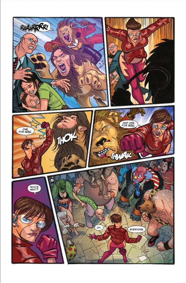
Oliveira delivers some colourful art, with some well executed sequential action, specifically when Jade's battling the Carnimals. Before that, there's a great piece of sequential art with Pearl and her mother, with a pretty good piece of humour thanks to the grouchy elder.

The team bring us some cartoonish, humourous moments, which help make it a lighter comic and an easier read. They deliver a chilling scene courtesy of Mr Croupe, the villain of the series, while the issue closes on a cliffhanger which could open up some interesting scenarios in future issues.

Overall, a very satisfying issue, that's well worth a read. A good start to the series, with classic comic-book action, plenty of humourous moments and a very amusing hook. I definitely recommend it.  

Thursday, October 31, 2019

The Sandman Universe Presents Hellblazer #1 Review


Writer: Si Spurrier
Artist: Marcio Takara
Rating: 6 of 8

The Sandman Universe Presents
Hellblazer #1
Image result for hellblazer 2019
There's a lot of things to like about the start of Spurrier's run and few to dislike. He really has a handle on Constantine's voice and, throughout the issue, his actions fit his character. Early in, Takara really set the mood and pulled me into the issue very quickly. Three pages in, John's doing his best to take on the monstrous hordes and it's here he shows his trademark cynicism, as well as his desperation. 

Spurrier was ingenious in the way he showed this, one that really fit with his character. I really liked the way Constantine described superheroes at the opening battle ''all capes and awkward bloody crotch-bulges'', the latter being an observation I've made with a couple of film superheroes over the years, namely the Justice League and the Merc with a Mouth. It made sense Constantine'd look down on the flashiness and larger than life nature of supers, but I really appreciated seeing that particular observation made here.

There's a few instances where the warlock's willing to sacrifice people for his own ends, even if that end is for the greater good. It's really not something you'd see often from comic heroes, especially not those from the DC universe. It's one of a number of things that sets him apart from other heroes. 

Image result for hellblazer

When it comes to art, at times, it really fits the scene; like when John's being haunted by the dead, or bleeding so badly he's close to death. Shortly after, there's a great use of sequential art, with John looking dazed, closing his eyes, then angrily opening them after having his rest disturbed. But 
earlier in the issue, there's a mass of people attacking a blue, spiky monster and I feel a number of them could've been more defined and given a bit more detail. 

The issue introduces an intriguing character, who's so far a bit of an enigma. I'm not sure if what they told the Londoner's to be trusted, especially due to the pretty curious ending and what he says before it. Hopefully Spurrier's Hellblazer will expand on him and explain if there's anymore he wants from the eponymous trickster. 

Overall, it's a pretty good issue, which's worth a read. If you're familiar with Constantine, you'll probably enjoy it more, but if you're not, I hope you still give it a go and see what you think. You might be pleasantly surprised.

Sunday, October 20, 2019

X-Men #1 Review


Writer: Jonathan Hickman
Artist: Lenil Francis Yu
Rating: 5 of 8

X-Men #1
Image result for x-men #1
Though there's a decent amount of things I liked in Hickman's Powers and House of X, there's also a extensive amount I have problems with. Chief among them is the feeling that very little, if anything, can threaten the X-Men, or Mutants in general. Now, various groups who used to oppose each other are now united in order to survive and share a home on the quasi-island, Krakoa.

Because of this, the team and their race have a lot less credible threat. They have scientists, who they've defeated and Sentinels, which they can easily destroy given the range of powers available on Krakoa. As well as this, Krakoa's got a series of defenses, while one group of Mutants have the ability to bring their recent dead back to life. 

With all of this combined, there's a lot less reason to worry about our protagonists than before. On top of that, characters like Cyclops and Storm come off less likable than they usually do, like her line ''or 
surrender and ask for unearned mercy''. It just doesn't seem like something she'd say. 

Related image

Earlier, she says ''Suicide bombs and serving the greater good are always the last refuge of a conquered people'', which feels ominous and a bit more threatening than I'd expect from a hero. Later on, when Scott's talking to Polaris, a lot of his dialogue doesn't sound like him ''my god, I loved that. I had waited my whole life for that''. Shortly after that, talking about his son, ''he was my son - of my blood. Like me'', which felt unnecessary, as he'd already said he's his son, so didn't need to repeat it.

I do love the way Magneto looks, with his all white armour and at the Orchis Forge, Yu gives us a really nice image, glowing with orange, while flying vehicles head towards it. There's also a fairly striking moment showing those Orchis have lost, indicating loss on both sides, which is welcome. There's a good moment of humour between Wolverine and Vulcan, above, which I liked, though I'm not sure rare steak lovers'll like it ;)

Though I was let down by the issue, I'll still check out the other new X-titles releasing over the next few weeks and I hope with the different creative talent involved, they'll bring some enjoyable reads that not only stand out from each other, but also what started this new era off.

Thursday, October 3, 2019

Leave on the Light #2 Advance Review

Note: I received a digital copy from writer Bradley Golden for review.
Writers: Bradley Golden and George Aguilar
Artist: Stan Yak
Rating: 7 of 8

Advance Review
 Leave on the Light #2 
Image result for leave on the light #2 comic
It's interesting how big a change can happen from one issue to the next. Though the debut issue was good, issue 2 is definitely an improvement. Even though issue 1 introduced us to Lassey, the series' killer, here we get to see him before he was executed, which is very welcome. We get an idea of how, despite this, he seems to be able to continue killing and get to Detective Marshall at his most vulnerable.

Though we knew he had a reason to hate Lassey, it was great to have it shown. Yak does a great job delivering some really creepy, memorable images. When Lassey's heading to execution, Yak zooms in, highlighting a chilling elation to his face. The artist brings us some truly horrific images, most of all during and shortly after Lassey's execution.

Image result for leave on the light #2 comic antarctic press

The issue's got a greater amount of hair-raising moments, like when Marshall's visiting the prison Lassey was executed in, or when his partner's investigating an eerie disturbance... Golden and Aguilar have definitely improved when it comes to the horror and in a comic like this, that's certainly a plus.

Yak's art fits the book a lot better than Sarabia's, particularly in the execution scenes mentioned above. With this increase in quality, I hope it's a sign of things to come for future issues.

Saturday, September 21, 2019

Lady Mechanika Sangre #3 Review


Writers: MM Chen & Joe Benitez
Artists: Benitez, Brian Ching & Martin Montiel
Rating: 6 of 8

Lady Mechnika Sangre #3
Image result for lady mechanika sangre #3
One thing's for sure: there's a lot to like about Sangre. I love the atmosphere pouring from one page to the other. Even though Lady Mechanika's been going for a while - through a lot of other series - I didn't really feel lost. It was easy enough to understand and I had no trouble getting into it.

The issue opens with a woman having lost her husband to a demon, refusing to let the same fate befall her children. Beth Sotelo imbues the scene with mesmerizing colours, from the light of the moon, to the crimson of the demon's blood soaked fingers. Everyone does a great job of illustrating the scene's horror and just how scared, desperate and distraught Malintze becomes.

Image result for lady mechanika sangre #3

In Spain, we're treated to an exciting fight between Mechanika and a pale skinned, cloaked figure. The fight never drags and goes on just long enough, without overstaying its' welcome. Mechanika later visits Dona Rosa in an effort to decode a nightmare. Chen and Benitez make Rosa into a really colourful character, which definitely helps a dialogue driven scene.

Even though the scene doesn't go on that long, I feel it's wordier than it needs to be and could've done with less dialogue, or some more action to punctuate it. The issue ends in a way that'll likely entice you to pick up the next. For someone like her, she looks very composed, dressed in a way that makes her seem a lot more sophisticated than you might expect.

Overall, a well written, well drawn issue, that's very newcomer friendly, perfect for horror lovers and those wanting some dynamic characters and an enthralling story. Definitely recommended. 

Thursday, September 12, 2019

Gotham City Monsters #1 Review

Writer: Steve Orlando
Artist: Amancay Nahuelpan
Rating: 7 of 8

Gotham City Monsters #1
Image result for gotham city monsters
Though I've always loved superheroes, I'm pulled towards horror. Like superheroes, there can be a lot of variation. Even if you're not really into slasher films, you still have psychological horror. If you prefer gorier stories, you've got Saw or 2013's Evil Dead. But one of my favourite kinds is definitely bursting with gothic imagery, centered around monsters.

That's just one of the reasons Gotham City Monsters is a dream come true for me. We get to catch up with a lot of characters we haven't seen in a long time, like Lady Clayface, or the vampiric Andrew Bennett. We don't get as much of Lady Clayface, but what we do get is well done.

Image result for gotham city monsters

Even though I'm not familiar with her, Orlando did well in explaining who she is and her struggle over her identity. I loved the scene introducing Orca, which has great illustrations, coloured and inked brilliantly. The quality of art, colour and inking is maintained throughout the issue and I'm really happy with it. Imagery and visuals are a very important part of horror, so I'm glad Nahuelpan and team really pull them off.

We get a good sense of where she's been and why she's doing what she is now. Some of the most violent scenes we get are with Frankenstein, with him burning a monster alive earlier in the issue and cutting another in half later on.

One of the highlights of GCM is how it ties into other series, like King's Batman, or Bendis' Event Leviathan. What Leviathan's done in that series and Action impact directly on characters like Lady Clayface, Orca and Frankenstein, which I really like. I love when other series add to another. I'd really recommend the issue and I'll definitely be reading the rest of the series. If it becomes an ongoing, I'd not only be delighted, I'd definitely check it out. 

Thursday, September 5, 2019

Legion of Superheroes: Millennium #1 Review


Writer: Brian Bendis
Artists: Jim Lee, Dustin Nguyen, 
Andrea Sorrentino + André Araújo
Rating: 6 of 8

Legion of Superheroes
Millennium #1
Image result for legion of superheroes millennium #1
Evvvvery roseee has its' thorn.. which is definitely something Rose Forrest is all too familiar with. Like Split's Kevin Crumb, she's got a split personality, with her base personality being quieter and more peaceful. Interestingly, her alter, Thorn, is a skilled fighter with immense strength, notably seen in a fight with Superman. When Rose has control once more, she doesn't remember anything Thorn did, but could still have to face the consequences of her alter's actions.

In Millennium, that's just one of her concerns, as we see Rose and Thorn living through numerous eras, fighting to break the cycle she's embroiled in. The issue uses a different artist for each era, with comic veteran Jim Lee opening the issue, using some of the best shading and sequential art I've seen in a while. Just the first page alone is really impressive. We start off seeing Rose from behind, but as it goes on, we get to see her from the side, then we gradually see more and more of her face, until she's facing the reader.

It feels like the art syncs up perfectly with the dialogue, showing that Rose starts off uncertain and nervous, due not only to what she's talking about, but also who she's talking to. Visually, Lee's showing that she's becoming more sure of herself, which could be because of the importance of what she's trying to say.

Image result for legion of superheroes millennium

He does a great job not only showing Rose's emotion when talking about her ordeal, but also Supergirl's compassion. Later on, she's in a darker era, that of Neo-Gotham and the younger, future Batman, Terry McGinnis. I prefer Lee's art, but Nguyen's works for this era, with the darker colours and overall look reminding me of Batman Beyond, where Terry's Batman originated.

Bendis really writes him well and it feels really consistent with how McGinnis was written in Beyond. One of the highlights of this part of the comic was definitely his conversation with Rose. One trying to break the cycle of violence, the other trying to deal with it as best they can. It's a well written argument, without any clear answer given, which I like.

Image result for millennium dc

In Kamandi's era, the art's reminiscent of Dark Knight Returns, both in colours used and the art itself. When we leave this part of the story, I feel there's more to be told, both with Kamandi himself and our titular heroine. I don't really have much to say about the last time period, though I feel it ended a bit too early for me to get as much of a feel for it as the others.

With the different art styles used, the issue does a very good job of giving a unique feeling to each future. Bendis and Sorrentino did well in showing Superman's importance, however dark the future. It's definitely a wise move, given how pivotal the Man of Steel is to the Legion, as well as what's coming up for the future team. Though it's not perfect, it does have some very good points and I hope the next issue succeeds in setting up the new Legion comic and continuing Rose's tale.

Adaptations: Knowing What to Change

  Adaptations Knowing What to Change When it comes to adaptations, it can be hard to get the balance right between them being loyal to the s...