Writer: James Tynion IV
Artist: Guillem March + Javier Fernandez
Rating: 6 of 8
Batman #93

Some say the past is but prelude to a greater story, yet to begin. That definitely applies to Batman. Fighting mobsters was but prelude to fighting unhinged killers and that was just prelude to gods and monsters. There's always something dark and cruel waiting around the corner and here, that something is all too familiar.
You could say Their Dark Designs was just setting things up for what's to come and maybe that is true. But despite that, it did well in giving us a feel for Tynion's Batman, one which manages to respect what came before, while using the recent - and not so recent - past to propel it forward. Here, the Designer's identity is revealed, one which I started to suspect only recently. It does make me wonder how this worked, given what's revealed, but maybe that'll be explained in a future issue.
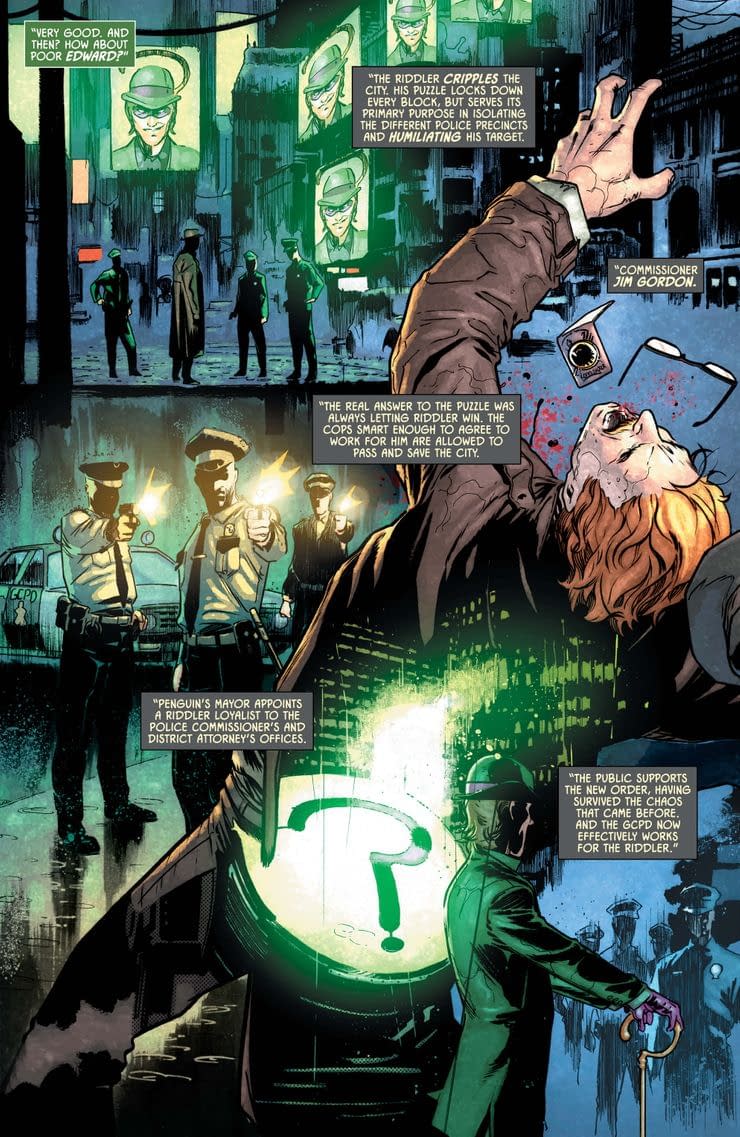
Early into the issue, Batman asks the Designer to tell him how his designs for 4 of Gotham's greatest villains would've been if they'd been enacted all those years ago, so early into the Knight's career. Most of it makes sense, though I do think Riddler's design's a bit unbelievable, as I don't think the GCPD would've been willing to kill a fellow cop, or work for a deranged super-villain.
I do like how Catwoman's design linked nicely to Penguin's, which I thought made sense, while also being pretty cool. Speaking of Catwoman, here she has to stop her boyfriend from losing his fortune, which reveals some interesting truths about him I didn't really expect. There's also a decent fight between Harley Quinn and Punchline - and though the fight's not as impressive as some earlier in the story, it does reveal the latter's mindset regarding Harley ad Joker, which I appreciate given how new she is.
Throughout, March and Fernandez do a good job in bringing Batman's macabre world to life, particularly with some rather disturbing depictions of the Clown Prince and the Designer. It would be remiss of me if I didn't mention Clayton Cowles' lettering, which is especially on point towards the end. It's a good indication there'll be some solid lettering come Joker War, which is definitely good to see.
Overall, despite a couple of flaws, this is another pretty good issue from Tynion, which definitely leaves me intrigued and excited for Joker War. If this opening arc's anything to go by, we're in for a treat.


Hey Robbie its me Grand Vizier from Twitter I loved this review
ReplyDelete:) Thanks very much, man! Really appreciate it.
DeleteGlad to hear.