Wednesday, April 15, 2020

Batman: Jekyll & Hyde Review

Writer: Paul Jenkins
Artists: Jae Lee & Sean Phillips
Rating: 6 of 8

Batman
Jekyll & Hyde
Batman: Jekyll & Hyde (Volume) - Comic Vine
There are always two sides to any coin. That applies to people, too. There's the brighter, kinder side we show the world... and the darker, crueler one we keep to ourselves. Most of his life, Harvey Dent acts on lesser devils and here, he tries to get Batman to do the same.

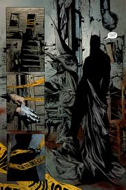
Throughout, he's tormented by childhood memories, revealing a part of him we never knew, possibly revealing just how deep his scars really go. One of my favourite parts of the story's the way Harvey switches back and forth between Harvey - the calmer, more level headed personality - and Two-Face, his crueler, unstable half. It really felt like the Banner and the Hulk, with each half fighting for control.
Batman Jekyll Hyde Issue 1 | Viewcomic reading comics online for ...
In both cases, one half considers the other darker, more destructive, needing to be suppressed, while the other feels it's counterpart's weaker and should be pushed aside. It's a very interesting dynamic and one I like seeing explored here. Dent's attempts to bring out Batman's darker half give us one of the greatest moments of the mini, with Batman having a rare display of vulnerability in front of Commissioner Gordon.  It was really refreshing to see, especially as he never usually shows a vulnerable side to Gordon. 

Overall, this is a really good story, well worth reading. Though, near the end, I did have a slight problem with Batman not being as focused on stopping individual acts of violence as I'd expect he would. I'm also not really sure what the ending meant, but maybe it's just open to interpretation. Ultimately, Jekyll & Hyde's definitely well worth a read and, if you're a Two-Face fan, you won't be disappointed.

Wednesday, April 8, 2020

Joker's Asylum II: The Mad Hatter #1 Review


Writer: Landry Quinn Walker
Artists: Keith Giffen + Bill Sienkiewicz
Rating: 8 of 8

Joker's Asylum II
The Mad Hatter #1
Joker's Asylum (2008-2010): The Mad Hatter - (EU) Comics by comiXology
A hero is only as good as their villains, their demented dark mirror and, with that being the case, Batman must be one of the greatest heroes of all. With such an expansive rogue's gallery, ranging from crime bosses like Black Mask and Penguin, to serial killers like Zsasz and the Joker, it only makes sense that DC'd make numerous series zeroing in on them.

That's exactly what they did with Joker's Asylum, in which the Joker both introduces and bookends tales centering around various Batman villains, this time focusing on the Mad Hatter. Hatter, or Jervis Tetch, is a man fixated around the idea of getting his Alice, like the girl from Lewis Carroll's Alice's Adventures in Wonderland.

Supergirl Comic Box Commentary: Review: Joker's Asylum Mad Hatter

To that end, he hypnotizes different women using the unique machinery in his hat, but usually fails to get his Alice. Here, though, he's doing his best to resist the urge to capture another 'Alice', struggling to resist the hat and the tea. Resisting the hat means resisting the urge to hypnotize and take another 'Alice' and resisting the tea to me means resisting the urge to dive into his own madness.

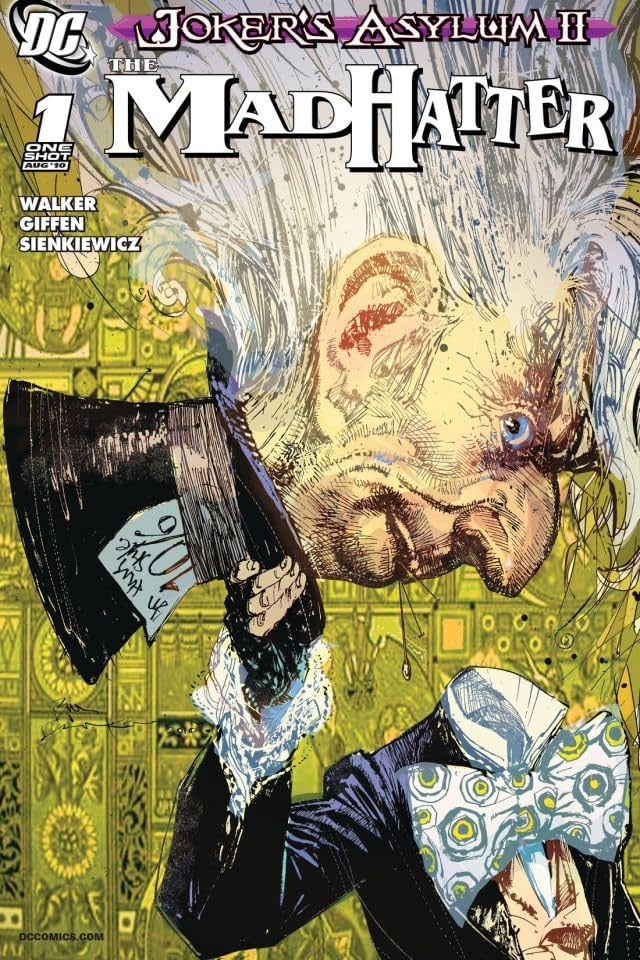
One thing I've definitely gotta praise about the issue's the art. Whether it's the cover, delivering such a simple, yet creative, image, or Tetch's simpler, more childlike drawings, Giffen and Sienkiewicz bring us some really memorable, praiseworthy imagery. Tetch's drawings give us a little insight into his psyche, which I really appreciate. The team also make Hatter a really diminutive figure, with a really big nose and large, protruding teeth, which match his animated iteration's appearance.

The duo also do a great job in illustrating just how fractured Tetch's mind really is and how much of a struggle resisting his lesser devils is for him. They really help elevate an already very good story. Overall, it's a pretty good issue, with very few flaws, though I think it could've delved more into why he's so obsessed with Alice and Wonderland itself. Despite this, the issue's well written and very well drawn and definitely worth a spin.

Thursday, April 2, 2020

Batman: The Adventures Continue #1 Review


Writers: Alan Burnett + Paul Dini
Artist: Ty Templeton
Rating: 6 of 8

Batman
The Adventures Continue #1
Batman - The Adventures Continue #1 (2020) – GetComics 
Batman is one of the most malleable characters in comics, so it makes sense that he's been through so many different iterations. Whether the goofier take by Adam West, or the more earnest ones from Nolan and Snyder, it all makes sense for each version.

That's just the kind of character Batman is. With his continuing popularity, I can see why there'd be so many different takes. Perhaps most notably, that of Kevin Conroy in Batman: The Animated Series. Here we get the continued adventures of his Dark Knight, in which he faces both Bane and a giant robot.

Batman: The Adventures Continue #1 - scans_daily

One of my few criticisms of the issue is that the fight with Bane's too short and that he's dispatched too easily, though in a way which makes sense for both characters. Even in a couple pages, Templeton does a great job in delivering some explosive action as Batman struggles to deal with a threat literally much bigger than him.

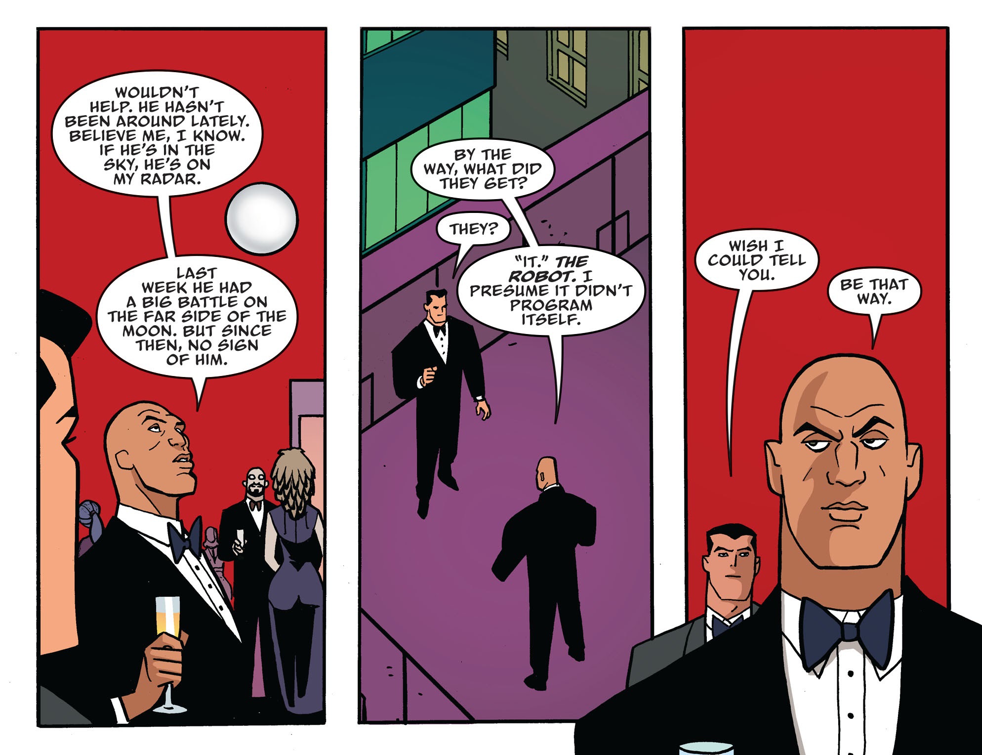
There's also a great scene between Bruce and Lex Luthor, which I really enjoyed. Luthor's got some terrific comments on both the Dark Knight and his Man of Steel, particularly one about keeping him 'on my radar'. I also really liked his comment on 'that incident with the Joker', which is a neat reference to The Batman/Superman Movie.

Overall, a really good 1st issue, ending on a frustratingly teasing cliffhanger, leaving you wanting more. It also closes with a really cool classic movie reference, which fits both the character and the scene itself. So, if you can, why not spend some time with masters Dini, Burnett and Templeton? You won't be disappointed.

Thursday, March 26, 2020

Project IMPACT #1 and #2 Review


Writer: Alan Russette
Artist: Stephan Petersen
Rating: 6 of 8

Project I.M.P.A.C.T. #1 and #2
Project IMPACT Comic on Twitter: "Unveiling the cover for the ...
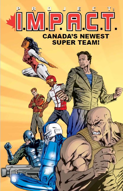
Sometimes an idea itself can be lacking, but in execution, it's elevated by the people involved. That isn't always the case and, for the most part, isn't the case here. The idea of a Canadian superhero team is fine, even if it's not as exciting as some others. 

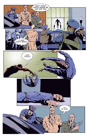
The shame is, Russette has the makings of a decent, perhaps very good, superhero comic, but it just doesn't come together satisfyingly to make that happen. A large part of this is due to the art, which definitely improves in the 2nd issue, mainly due to heavier inks, which I definitely appreciate. In issue 1 though, there was too much of a faded look due to lighter inks, which made the characters look less detailed than I'd like. 

Project: I.M.P.A.C.T. #1 - (EU) Comics by comiXology
In issue 1, there's one scene with armoured hero French Guardian with a few cops in the background, who're lacking in detail and are a lot sketchier than I'd like. I definitely prefer issue 2, for a lot of reasons. As well as the art being more detailed, we get more of an attitude from I.M.P.A.C.T. leader Pulsar than in the previous issue, which I definitely liked. It added more personality to him, while still keeping him level headed, which is not an easy feat.

There's also a greater sense of fun, thanks to his fight with Huoyan Dashi, something we didn't really get with multiple fights in the 1st issue. The beast he fights is very well realized, with a very familiar design for their kind. The issue ends with an intriguing cliffhanger, expanding on the larger threat.

Ultimately, while the 1st issue is disappointing, the 2nd issue is a noticeable improvement, so this could be a case of the series still finding it's feet. It could improve with time, as it already has in a couple ways, from one issue to the next. 

Friday, March 20, 2020

Hotell #1 Review


Writer: John Lees
Artist: Dalibor Talajíc
Rating: 6 of 8

Hotell #1
 Image result for hotell #1
Horror can be one of the most malleable genres around. Able to go in multiple different directions, while still giving a similar feeling of dread, it's no wonder so many writers choose to dip their toes into this ever shifting pond. In Hotell, Lees brings us a hotel that's been host to many visitors with a variety of terrifying tales.

In the 1st issue, we get a classic tale of someone heading to a distant hotel in order to escape a terrifying ordeal. Of course, it's only a matter of time before what you're running from catches up with you - and sometimes, what you're running to can be even scarier. Lee and Talajíc do a great job of showing just what Alice's trying to escape and just how extreme that really is.

Image result for hotell #1

It's an important thing to do a story, especially in a visual medium. We get a sense of just how important it is that she escapes and just how difficult that could be. The issue's definitely not short of horrific imagery, ranging from Alice being choked, to hands exiting a mouth, to... feeding. Later in the issue, the team did well in making me feel sorry for a monster, which I definitely applaud.

Overall, a very good debut, that's definitely worth a read. Well written, well drawn, it comes together very nicely. The only complaint I have is that I couldn't understand who was on fire later in the issue. I think it could've done better in establishing who that was. Other than that, I was very happy with the issue and definitely recommend it. I doubt you'll be disappointed.

Thursday, March 12, 2020

Stealth #1 Review


Writer: Mike Costa
Artist: Nate Bellegarde
Rating: 7 of 8

Stealth #1
Image result for stealth #`1
Even though it's lovely to get the usual antics from familiar characters like Spider-Man or Superman, it can be refreshing to get a unique twist on the familiar superhero concept - and that can definitely be found in Stealth #1.

Costa adds a very human layer to the larger than life world of a superhero, which I really credit him for. He does this by having Tony deal with a very relatable problem, which is a father with Alzheimer's. It's not something I usually see in superhero comics and I commend Costa for it. It's not just casually thrown in or forgotten about, but a significant part of the issue.

Image result for stealth #1 comic

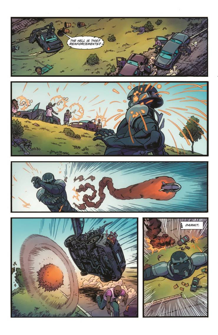
He isn't just concerned about his Dad, but also his city, which is falling apart in different ways. Is Stealth the one to save it - or will he only make things worse? The issue isn't lacking for action either, ranging from the hero taking on an armed robber to battling a group of armed men. Bellegarde does a great job illustrating the impact as Stealth lands on the car, along with the cracking of the glass. His art really adds to a lot of moments throughout the issue.

You'll see more on that twist later in the issue, which really is brilliant. Overall, a terrific 1st issue that's well worth a read. Both the writing and art come together very well to make a really good issue, that's well worth a read.


Friday, March 6, 2020

Join The Future #1 Review


Writer: Zack Kaplan
Artist: Piotr Kowalski
Rating: 7 of 8

Join The Future #1
Image result for join the future comic
It can be hard to change. Sometimes, you just want to stay where and as you are, instead of making a change to how you live. But sometimes, change can be all too inviting - even if it means compromising who you are. That's a conflict Mayor William and his people, especially his kids, have to confront.

While his son Owen wants them to start using more advanced weaponry and technology, William doesn't want him or his daughter to compromise, to bargain away their values. I think he wants them to lead a principled life, despite it's difficulty, though I'm not sure if that's what his son wants. Right now, I'm not sure what his daughter Clementine wants, but maybe that'll be made clear in future issues.

Reading the issue, I couldn't help but feel the promise of a megacity eliminating disease, crime and poverty was too good to be true. I felt there had to be a catch somewhere - and I feel like I was proven right.

Image result for join the future comic

Kowalski delivers some really good art; like earlier in the issue, when Clem's gotta deal with an attacking wolf. There's a palpable sense of fear across her face, though I feel he could've shown more ferocity in it's eyes. I've also gotta compliment Kaplan and Kowalski for a brief moment where we see Clem stop to look at the megacity, while her brother and father walk on. It says a lot without any dialogue, which is a great skill to have.

Later in the issue, their town's visited by a man trying to convince them to move to a megacity. Even though he's trying to sell the idea of a better place to them, he's flanked by two armed guards, indicating a lack of trust of the people he's talking to, or a more sinister intent. At the end of the scene, even his face radiates a sinister aura. 

Overall, a really promising debut, with some interesting ideas and intriguing conflict. The stage has been set for a compelling series, with a lot of questions to answer and a really thrilling cliffhanger that'll be great to see followed up. I heartily recommend it.


Adaptations: Knowing What to Change

  Adaptations Knowing What to Change When it comes to adaptations, it can be hard to get the balance right between them being loyal to the s...